Set your eCommerce site up for success

The Coronavirus Pandemic has been responsible for many changes to how we live our lives, including curtailing our desire and ability to visit retail stores in-person. In fact, during 2020, ecommerce growth in the UK alone increased nearly fivefold and this year (2022) 20.3% of global retail sales are expected to come from online purchases. And when you see brands like Primark finally taking the online plunge, you know it’s a trend that is here to stay.
But having an eCommerce site isn’t just a case of putting your products on a website and hoping for the best. It’s about creating a great user experience which will have customers coming back time and time again.
We take a look at some of the easy things you can do to ensure your eCommerce site is a winner.
1. Avoid cluttering your pages
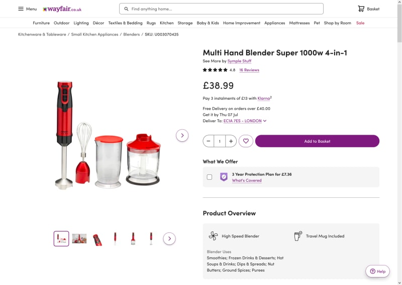
While it might be tempting to cram as much information into a single page as possible, don’t. People want to quickly see what they are buying rather than having to fight through lots of information to get to the salient points.
Wayfair.co.uk is a great example of how to get it right. Although they do provide lots of information on each individual product, they put everything under drop-down tabs, so you can pick and choose what information you see when.

2. Be very clear on your pricing
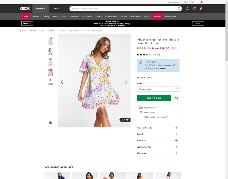
For many of us price is the primary driver for potential purchases, so it needs to be as clear as possible. If a potential customer can’t understand or easily find the price of an item, then they probably won’t buy.
ASOS.com is a good example of how to display prices. Not only do they clearly show the price but also the discount you will be getting, which is a good way of encouraging someone to buy.

Also make sure you are clear about delivery charges. A survey found 55% of people abandon their shopping carts because they felt extra costs, such as delivery fees and taxes, were too high. Consider giving free delivery, as for many, that’s an added incentive to buy.
3. Use high quality video and images
Video is increasingly popular and important for ecommerce as it offers the opportunity to really show off a product in much more detail. In fact, a recent survey found that 69% of consumers preferred to watch a short video to learn more about a brand’s products or services.
You could consider an explainer video, which are particularly useful if you are offering more complex products or services, but referring back to tip two, don’t do what SalesForce has done and ask people to sign up to watch the videos.
You could also opt for simple product videos, such as on the Nike site.
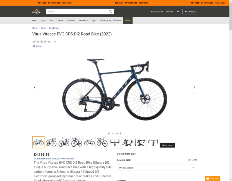
If you use still photography, use a number of high-resolution images from different angles, such as wiggle.co.uk do for their products.

And always try to show the product ‘in context’ such as how earphones look on someone’s head or how a blender looks in a busy kitchen.
4. Invest in real customer reviews
Positive customer reviews are worth their weight in gold, but just make sure they are genuine. Everyone is aware nowadays that some sellers use fake reviews in order to sell more products, so avoid being tainted with this brush by using a good peer review system, such as Trustpilot. And, while it might not always be possible, try and say thank you for any good reviews and address all the bad ones. Sometimes, it’s how you deal with negative feedback that will convert someone into a customer.
5. Build trust by being contactable
We’ve all heard the horror stories of things going wrong online, so make sure your site provides a clear and easy to understand returns policy, offers money back guarantees and enables people to contact customer services, easily. These are the things that help people feel more comfortable about making a purchase online. After all, who wants to buy something from an organisation you can’t communicate with?
6. Create a brand personality
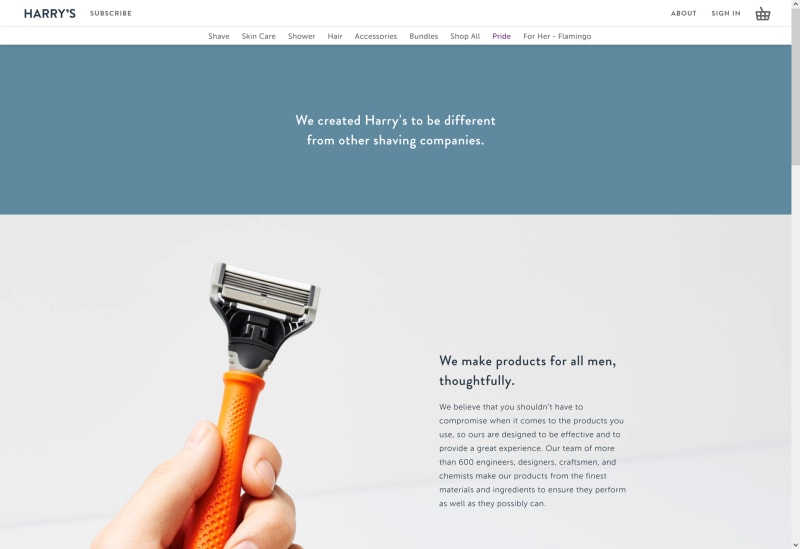
Brand is so much more than a logo or a colour scheme. It’s about who you are, what your ethos is and why you exist. Remember online is a very competitive place, so having a genuine brand story that resonates with your target audience is one way of ensuring customers choose you over the competition. Harry’s is a good example of a brand who put their core values at the heart of everything they do.

7. Don’t ask people to register to checkout
Forcing people to create an account to be able to checkout their purchases is a big turn off and likely to lead to a lot of abandoned carts. It’s fine to ask people to sign up for newsletters, discounts or exclusive content as long as you make it easy for them to unsubscribe whenever they wish. Make it easy for people to buy - putting obstacles in their way is not helpful!
8. Link with good causes
Nowadays more and more of us expect our favourite brands to give something back to the world we all live in, so another effective way of increasing online sales is to hook up with a good cause or charity that reflects the values of your brand.
As an example, Neve’s Bees sells beeswax cosmetics and dedicates an entire page to what can be done to save bees in the UK. They also donate 10% of their profits to the Wildlife Trusts.
Just remember, this is not a tick box exercise, as people will be able to see whether you are genuine or not.
This list is by no means exhaustive, and doesn’t include things like website speed , optimising your checkout, or even accessibility, which are just as important and topics I’ve covered previously, but hopefully, it will give you an idea of what makes for a winning eCommerce site. And if you do need any help, please get in touch. With years of experience of building ecommerce sites, I’m more than happy to help you achieve success online.
