A beginner’s guide to making your website more accessible

“The power of the web is in its universality. Access by everyone regardless of disability is an essential aspect.” Tim Berners-Lee, W3C Director and Inventor of the World Wide Web
Few of us can imagine not accessing the internet. As well as providing us with a wealth of information, it also allows us to shop, access healthcare and interact with our friends. And for many disabled people the internet is a lifeline, especially if they struggle to leave their homes.
But a recent report has found 96.8% of website home pages fail to meet the standard accessibility requirements. This means a disabled person using one of these websites would struggle to access the information provided.
Making your website accessible isn’t actually that difficult and with 14 million disabled people in the UK not only is it the right thing to do, but it also makes good business sense as it increases the number of potential visitors and customers to your site.
Read on to find out more about web accessibility and some of the easy things you can do to make your website more accessible.
What is web accessibility?
Web accessibility is about building a website which anyone can easily use and enables disabled people, in spite of their impairment, to perceive, understand, navigate, interact with and contribute to the web.
Web accessibility applies to all types of disabilities including:
- Visual impairments: such as blindness, colour blindness or the partial or total inability to see or perceive colour contrast
- Hearing impairments: Deaf or hard-of-hearing users will struggle to interact with video or audio content
- Motor skill/physical disabilities: some users may struggle to use a mouse or select small elements on the screen
- Cognitive disabilities: users with learning disabilities or conditions such as dyslexia or dementia may have difficulty reading or remembering information
- Photosensitive seizures: flashing or blinking graphics pose a danger to people prone to seizures
The W3C Web Accessibility Initiative’s (WAI) guidelines on web accessibility are recognised as the international standard for building accessible websites and provide designers and developers with guidance on how to recognise and address accessibility issues.
5 ways to make your website more accessible
Making your website accessible isn’t just about ensuring disabled people can access everything, it’s also about making your website more user-friendly for non-disabled users. From people using mobile phones to those with temporary disabilities, such as a broken arm, an accessible site benefits everyone.
Web accessibility covers everything from content management systems to forms, and in future posts I’ll discuss different aspects of accessibility, but for now, let’s look at some easy changes you could make to make your website immediately more accessible.
- Include Alternative (Alt) Text for all images Alt text describes an image. This means if someone is using a screen reader, they will understand what the image is showing. Alt text also shows if an image fails to load on a user’s screen.
- Give links descriptive names Visually impaired users can use screen readers to scan for links on a webpage. This means they may not see a link in the context of the rest of the page, so ‘click here’ will be meaningless. Instead give links a descriptive name. For example, change ‘Click here to learn more about accessibility’, to ‘To learn more about accessibility, read our blog on improving speed and security’.
- Be careful how you use colour People perceive colour in different ways and low-contrast sites can cause problems for users who have low vision, are blind or colour blind. Choose colours that contrast well to ensure everyone can easily distinguish between various elements on the page. This colour contrast checker will tell you if you’re on the right track.
- Include audio transcripts If you include any audio on your site always include a text transcript for those who can’t hear. YouTube provides transcriptions for free, just double-check the copy for accuracy.
- Use headings correctly Headings break up a web page and tell readers what information is contained in a section or paragraph. While it might be tempting to make a heading stand out by making it bold or changing the font size, this won’t be recognised by screen readers, which stops users being able to easily jump to the sections they are interested in. Instead, always use the proper h1-h6 heading elements to structure your content.
Organisations getting web accessibility right
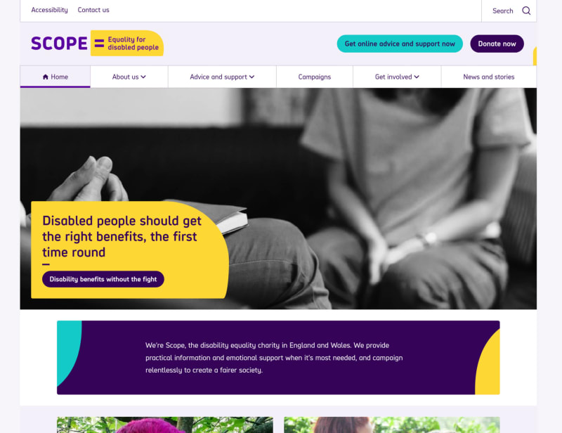
Scope https://www.scope.org.uk/
With a big ‘skip to main content’ banner (use the tab key), large images and well-designed buttons, the Scope site isn’t just a great example of an accessible website, it also shows accessible sites don’t have to look dull and boring.

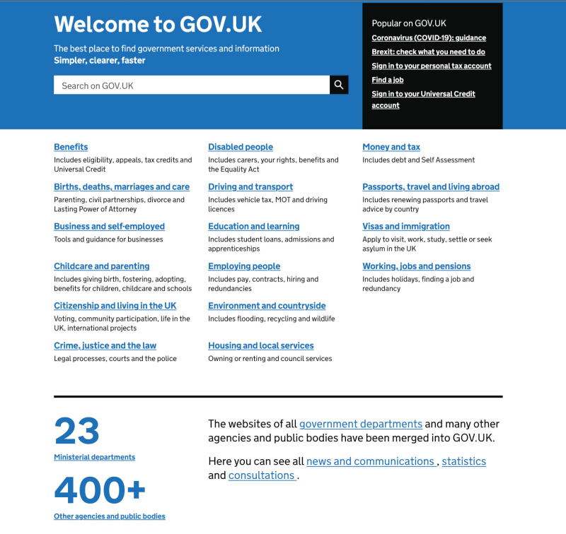
Gov.uk
https://www.gov.uk/ It might not be the prettiest website, but it does try and make the overall experience as inclusive as possible. As well as having well-structured HTML, it also incorporates a lot of small enhancements for screen reader and keyboard users, so they have full use of the site.

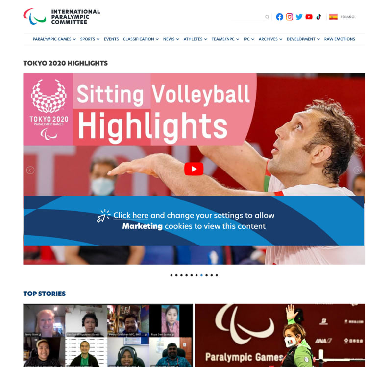
Paralympic.org
As well as including a text size adjuster on the home page, the images and video are large with plenty of white space around them to help them stand out.

Take your first steps to web accessibility
If you’re still not convinced about making your website accessible, bear in mind it also helps with your search engine rankings, so there’s really no reason not to do it.
