(Sadly, due to illness, this business has now closed.)
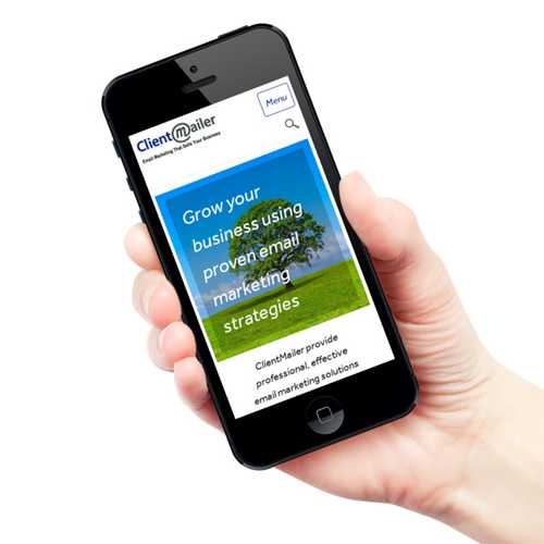
Some months ago we were asked by ClientMailer, a well-established email marketing company in Oxford, to redesign their website. The existing site had been in place for many years and no longer reflected the company. The site was looking rather old-fashioned, didn’t work properly on mobiles and tablets, nor did it appear in the search engines.
AttractMore worked closely with Peter Davey of ClientMailer to create a new website that represented the professional standing of the company, was well-organised and worked well on all screen sizes.
This was implemented earlier this month and this is what Peter had to say about the project.
Working with Roger has 3 huge advantages, and one drawback! The 3 main advantages are 1. He is a skilful designer so your website looks great on all platforms and screen sizes 2. He understands how to get your website working for you commercially and not just as a work of art and 3. He uses technology to promote your business and make things easier for you. And the drawback? You kick yourself for not contacting him 6 months, 1 year or even 2 years earlier so you could have had a highly effective website growing your business sooner!
Unfortunately, due to illness of the main director, the business has closed.
Begin with the End in Mind
For us it is essential to establish the goals of the new website and that requires a good understanding of the business, its history, the current status and the plans for the future. We spent time with Peter to understand these aspects and to gain a good appreciation of ClientMailer as a whole and how the new website would contribute to the future strategic direction of the company.
After understanding more about ClientMailer, we worked with their managing director to define a series of personas: these are hypothetical people who represent audience segments, e.g. visitors who have never used email marketing before. For each one we documented their circumstances and what they might want to see on the website. These hypothetical individuals represent audience segments and by personalising them in this way it helps all concerned to maintain focus on the people who will use this website.
Design
Using all this information we created a Style Tile which encapsulated the static design of the new website.
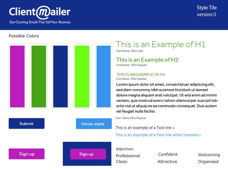
As you can see, we defined a colour swatch, typefaces, type sizes etc. You will also see this is version 5 as this is where we settled after 4 previous iterations. We had a number of discussions about different typefaces and colours but we reached a point where we felt that this set of styles represented the company properly and agreed that they would appeal to the intended audiences.
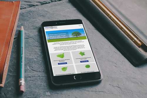
Having discussed the structure of the site and how the navigation should be constructed, we got to work on the layouts of the pages, starting in all cases with the layouts for smartphones then moving up to larger and larger screen devices. We spent some time working on the navigation of the site as we knew it was crucial to its success. We considered what the different personas we had defined would want to know as they progressed through the purchase cycle and then made sure this information was available.
Traditionally, ClientMailer have not had many new leads from the search engines (not surprising since the old site did poorly in that area) and the main source of new clients was through face to face networking and by referrals. However, we were keen to see if there was an opportunity to develop a new source of new business here so, alongside the design activities we were working on key phrases that searchers would use to find the website. It is too early to tell if this has been successful as yet but there is certainly potential in this area.
Build
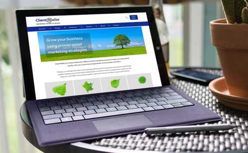
At this stage, Peter started writing the content for the pages and selecting images to use. As content started to take shape we were able to define page templates and adjust content to ensure that we were prioritising the most important words and images. After settling on the page templates we were then able to start on the build of the site and for this we used WordPress. WordPress is a sophisticated content management system which allowed us to create standard templates for gallery pages, support pages etc. This makes it easy for ClientMailer to add information to the site knowing that they will not break the layout of the pages.
Testing and Implementation
Testing is an essential part of any professional web project so that the client has confidence that the new website will work across all platforms and devices. AttractMore use an online service to do this which allowed us to test over 40 combinations of browser version, operating system and device in less than 2 weeks. Once this was completed, we proceeded to a speedy implementation followed by our standard series of checks once the new site was live.
Benefits
ClientMailer now have a modern and professional website which properly reflects the products and services that they offer to their customers. The site looks good and works well on all device types and, importantly, it loads quickly. Peter Davey and his colleagues at ClientMailer are very pleased with the new site and they full expect that it will help them win more business in the future.
This has been a great project from our point of view as well and we would be delighted to work with other organisations to help them promote themselves more effectively using the internet. Please Contact us for a no-obligation discussion.
